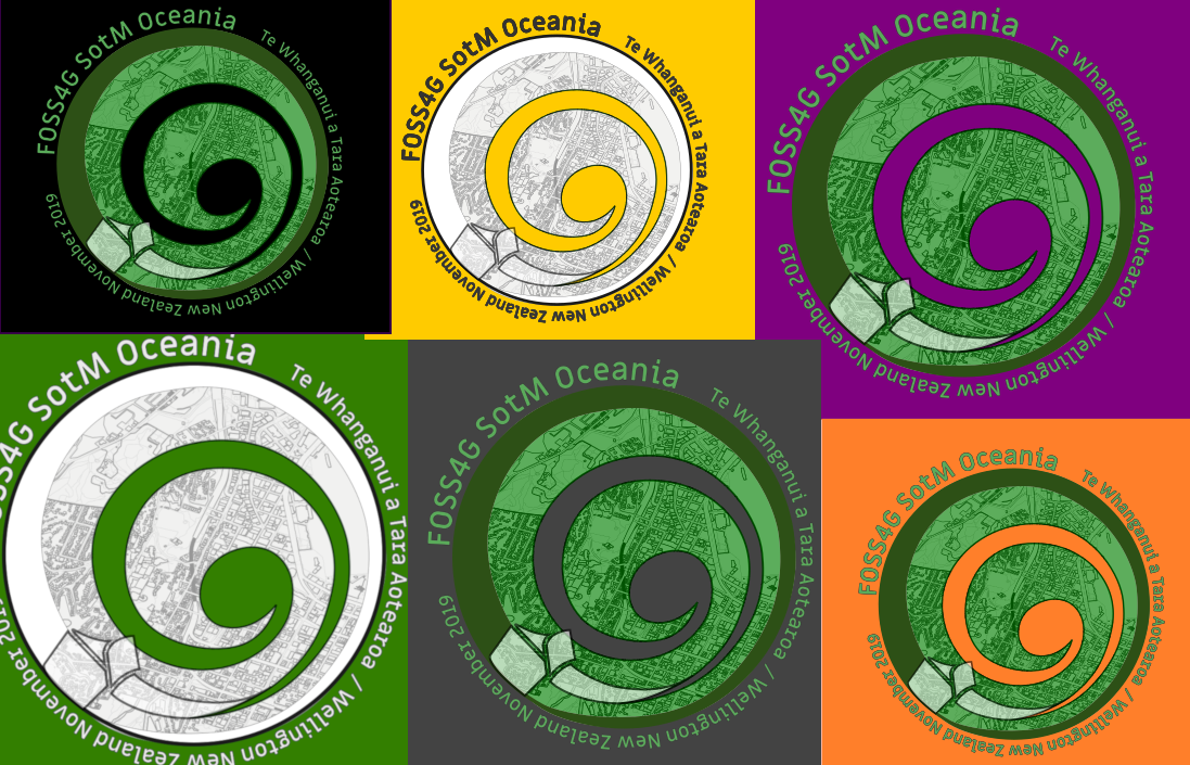
An entry to the logo design competition for FOSS4G SotM Oceania 2019. I wrote at the time:
“This design is inspired by the Koru, a Maori symbol of strength, growth, nurturing and hope, drawn in turn from the characteristic shape of an unfurling fern frond. The motif of a spiral, or circles-within-circles, is also common to all the cultures of Oceania, meaning variously ‘meeting place’, or ‘journey/passage’ and more. The green colour scheme is a direct nod to greenstone/pounamu used for tools and jewellery by Maori; with an OpenStreetMap-based map of wellington etched into the surface. The OSGeo ribbon sits at the start/end of the spiral/journey, marking a place of transition and change. A generally accepted Maori name for the conference location is given prominence, in lieu of the exact dates.”